Best Paint Colors for Your Baby’s Nursery
How to Choose Soothing Shades That Support Better Sleep
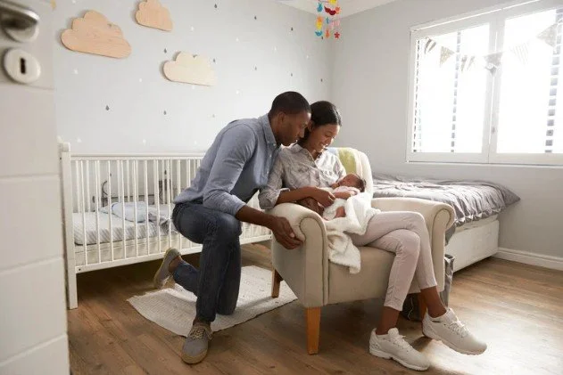
Designing your baby’s nursery can be a fun and special part of preparing for their arrival. But did you know that the color you choose for their walls can actually impact how well they sleep?
As a pediatric sleep consultant, I always encourage parents to think beyond style when picking nursery colors. The right shades can help create a calm, restful environment — while bright or bold colors might unintentionally overstimulate your little one.
Let’s explore the best nursery paint colors to promote sleep, plus simple tips for creating a peaceful, sleep-friendly space.
Why Color Choice Matters for Baby Sleep
Babies are highly sensitive to their surroundings. Harsh colors or overly busy decor can:
Overstimulate their developing brains
Make it harder for them to wind down at sleep times
Disrupt naps and night sleep
On the other hand, soft, muted colors help create a calming environment that signals: “It’s safe to relax and sleep here.”
Best Paint Colors for a Sleep-Friendly Nursery
1. Soft Blues
Pale sky blue
Dusty blue-gray
Muted aqua tones
Why: Blue shades are known for their calming effect on both children and adults. They help lower heart rate and blood pressure, signaling the brain to relax.
2. Gentle Greens
Sage green
Soft mint
Pale olive
Why: Green connects to nature and brings a sense of peace. Earthy greens work especially well to create a serene, grounding feel.
3. Warm Neutrals
Warm beige
Soft taupe
Greige (a mix of gray and beige)
Why: Neutral shades make the room feel cozy and quiet without overstimulating the senses. These colors also grow with your child and work well with any decor theme.
4. Lavender and Mauve Tones
Dusty lavender
Soft lilac
Muted mauve
Why: Light purples offer a gentle, soothing vibe. They’re a great alternative to traditional pink if you want something soft but slightly different.
5. Pale Pinks and Peachy Neutrals
Blush pink
Soft peach
Barely-there rose tones
Why: Warm, barely-there pinks and peach tones create a gentle, nurturing atmosphere without feeling overly bright or flashy.
Colors to Avoid in a Nursery
Bright reds and oranges (these are energizing, not calming!)
Bold yellows
Dark, intense shades like navy, deep purple, or black (can feel heavy and overstimulating for a small child’s space)
Tips for Creating a Sleep-Friendly Nursery
Stick with matte or eggshell finishes — glossy paint reflects more light, which can feel stimulating.
Limit bold patterns or high-contrast wall art that might catch your baby’s attention during sleep times.
Use blackout curtains regardless of your wall color to keep light controlled for naps and early mornings.
Keep clutter minimal — the calmer the space looks, the calmer your baby will feel.
Remember: The goal is to create a peaceful, womb-like space that encourages rest — not an exciting playroom.
Final Thoughts: Choosing the Best Nursery Color for Sleep
When it comes to your baby’s nursery, think soft, muted, and calming. Whether you prefer cool tones like gentle blues and greens or cozy neutrals like taupe and blush, choosing a sleep-friendly paint color helps set the stage for better rest.
Your baby’s environment matters — and a soothing color palette is one of the easiest ways to support their sleep from day one.